A colour to consider before redecorating
A distinctive interior need not be assembled entirely from luxury furnishings. The relationships between colour, texture and proportions can be just as influential as the prices of individual objects. A carefully selected textile or painted surface can alter the character of a room that already contains good furniture. On 17 November 2026, IKEA US announced its 2027 Style Guide, naming Wild Fig as its choice of colour for the coming year and outlining four directions for residential design.
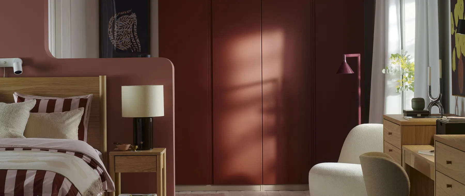
The botanical purple tone is presented as an alternative to a purely neutral palette. In the official image accompanying the announcement, a deep reddish-purple surface is juxtaposed with lighter furnishings, natural materials and subdued decorative elements. The colour is given enough space to become an architectural feature rather than being confined to an isolated ornament.
For Luxury Yacht Guide readers, the guide is interesting not because IKEA is a high-end furniture house but because it explores a number of design approaches that can be combined with craftsmanship and more substantial investment pieces. Someone furnishing a coastal apartment or renewing a room in an established residence may want to keep a particularly fine table or chair while experimenting with the elements around it. The scale of the proposed changes can be determined by the actual condition of the property rather than by a collection of new products.
The four directions identified by the retailer are its own interpretation of trends, not independent forecasts of the entire residential design market.
Wild Fig and the role of a deep colour
The new colour sits within a family of purple hues that can appear warmer or cooler depending on the surrounding finishes and illumination. Timber with honey-coloured undertones may create a different relationship with it from a cool grey surface. The retailer also suggests combining the shade with brighter tones, including electric blue and pink.
There is no requirement to introduce a strong colour across an entire room to explore the effect. A cushion, a decorative object or a small painted area may provide a useful initial comparison. The size of that area influences the visual impression: a deep colour occupying a whole wall can become the principal feature of a room, whereas the same shade appearing in a small accessory may simply connect two other elements.
The appearance of a pigment or textile in a digital image is not necessarily identical to its appearance in a home. Screen settings, photography and lighting can all affect the impression. Prospective buyers should establish the actual finish and examine a sample in the intended location. If changes involve painting an existing surface, the suitability of the coating for that surface needs to be considered independently of its colour.
A residence beside the water may receive a particularly strong variation in natural light during the day. In that setting, a subdued supporting palette can allow both the view and the stronger interior accent to remain distinct. Someone occupying the home chiefly during the winter may instead assess the colour in relation to evening lighting. The appropriate choice reflects the way the room is used.
Nostalgia without reproducing a period room
The guide's first direction looks towards the furniture and colour relationships associated with the middle of the twentieth century. IKEA calls this The New Nostalgia. Rather than proposing a complete recreation of a period interior, the retailer describes combining familiar forms, earth tones and objects with personal significance.
An owner who has retained a well-made chair or sideboard from an earlier home can approach such a scheme from the existing object. A contemporary lamp may complement the proportions of the furniture without imitating its original surroundings. A textile with a subtly related colour can help connect the piece with other furniture in the room.
The historical associations of older furniture can also be worth discovering. An object acquired second-hand may have identifiable origins, while a contemporary item inspired by an earlier design is a different proposition. A vintage appearance does not establish the age, maker or originality of a particular object. Those details matter if a buyer is paying for its authenticity rather than simply its appearance.
This direction has particular appeal for people gradually establishing an individual interior over several years. A collection of objects chosen at different times need not look inconsistent if the relationships between them are considered. The most distinctive element may be a personal object with a history that cannot be reproduced through the purchase of an entirely new room setting.
Colour, pattern and the architecture of a room
A second direction, Color Block Party, draws on the visual language of modern fashion and pop art. Here colour is used to delineate areas or create deliberate contrasts rather than merely applied as a finishing touch. In an open-plan home, a change in colour can help identify a dining or reading area without introducing an additional partition. The actual geometry of the space remains an important consideration.
The approach requires judgement about which surfaces should be emphasised. In a compact room, several strong colours of similar intensity may compete for attention. A more limited palette can make the intended contrast clearer. A homeowner can test a combination through smaller movable pieces before deciding whether to undertake larger architectural changes.
Whimsical Wonder, the third direction, concerns the combination of patterns. The guide refers to florals, checks and stripes, together with textured materials. The combination of different motifs can make a room feel less formally coordinated, while a relationship in colour or scale can prevent the individual elements from appearing entirely unrelated.
For a person who owns an important painting or a decorative object, the amount of pattern elsewhere in the room may influence how clearly that work can be appreciated. A relatively quiet background can be useful, while another space may benefit from a more layered appearance. The choice need not be applied to the entire house. A guestroom, for example, could offer a different character from the principal living area.
The guide does not establish that one of these approaches will increase the financial value of a property. Its contribution is to offer ways of considering the experience of the space, including options that do not require expensive replacement of existing furniture.
A quieter scheme with useful storage
Mindful Minimalism, the fourth design direction, brings together references to Japanese wabi-sabi and Scandinavian hygge. IKEA's description emphasises natural materials, uncomplicated furnishings and storage. The cultural concepts have broader meanings than the appearance of a particular retailer's product collection. Nevertheless, the combination suggests an interior in which comfort and the character of materials are given prominence over the accumulation of decoration.
Practical storage can have an especially important role in such an arrangement. Objects needed regularly should be accessible, while items used infrequently can be placed elsewhere. The aim does not have to be a completely empty surface. A room can remain orderly while displaying books, photographs or a collection of personally meaningful pieces.
This is a familiar consideration for yacht owners, where the usable area of a cabin may be limited. Domestic furnishings, however, should not be assumed to be suitable for installation aboard. A yacht requires different arrangements for the security of movable objects and the suitability of materials. The general principles of avoiding unnecessary clutter and understanding how a space is used can still inform a residential design.
The guide also addresses households shared by several generations and the changing ways in which rooms are occupied. A space used for reading during the morning may need to accommodate conversation or work later in the day. The seating, lighting and storage arrangements can be selected with those different activities in mind.
Rather than purchasing attractive containers or cabinets before establishing what should go into them, a homeowner can begin by examining the objects that already need accommodation. The result may require fewer new pieces and offer a more useful arrangement.
The place of accessible design in a comfortable home
The 2027 guide presents a retail interpretation of the growing interest in personal expression, comfort and flexibility at home. For readers who prefer to invest in a few particularly good pieces of furniture rather than buy uniformly expensive objects, that perspective is worth considering. The cost of the entire interior need not correspond to the value of its most substantial element.
A well-constructed sofa or dining table may remain in use for years while textiles, lighting and decorative accessories evolve around it. Changes in colour can become a relatively manageable way to renew a room without discarding materials that remain sound. This approach can also leave more room in the household budget for skilled work where it matters, such as repairs to older joinery or specialist treatment of an existing floor.
IKEA's announcement does not provide an installed cost for any of the four proposed interiors or guarantee the availability of particular products in every market. The full guide is a starting point for visual exploration; purchases should still be made according to dimensions, materials, care requirements and the needs of the household.
The most useful way to approach Wild Fig and the other ideas may be to select one that brings something genuinely new to the existing home. A room that reflects the interests and habits of its occupants can have a greater sense of individuality than one that simply replicates the most recent design photograph.
Sources and lead image
Source documentation: https://www.prnewswire.com/news-releases/ikea-us-unveils-2027-style-guide-and-color-of-the-year-302941001.html. Lead image: An interior illustrating the 2027 IKEA Style Guide and its use of deep colour — IKEA US, official style guide image released with the 17 November 2026 announcement; illustrative room setting.. Official issuer-supplied press photograph, reproduced for editorial coverage of the specific announcement and resized for web display.