A Swiss lake becomes a watch dial
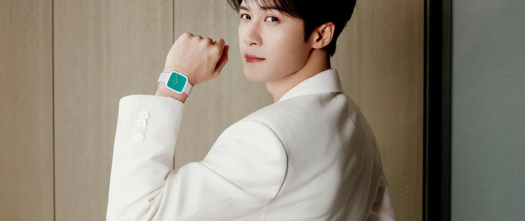
Rado has introduced the True Square Thinline x Tan Jianci Limited Edition, a collaboration that began with the actor and brand ambassador’s visit to Switzerland. The colour of Lake Lungern, with its striking shifts between green and turquoise, became the guiding reference. The finished watch pairs a luminous mother-of-pearl dial in that colour family with white high-tech ceramic and a deliberately slender overall profile.
The strongest design partnerships often begin with a particular observation rather than an abstract request for something distinctive. Here the source is a recognisable landscape and a personal journey. That narrative matters because the watch itself has relatively restrained form: the unusual quality is found in the interaction of colour, material and small graphic accents. A collector can appreciate the object without needing to know the entire story.
An ultra-thin rounded-square case
The chosen starting point is Rado’s True Square Thinline, recognised by its rounded-square profile. At approximately five millimetres thick, it is notably low on the wrist. Such a slim shape can work well under a cuff and can feel more like a piece of jewellery than a bulky sports instrument. Rado retained the basic model after reviewing alternative ideas with Tan Jianci and its product team.
A case with straight and curved boundaries presents different ergonomic demands from a circular design. Its width and the way bracelet links meet the wrist can affect comfort more than a simple diameter figure suggests. Rado’s high-tech ceramic construction aims to provide lightness and a smooth surface. As with any unusual case shape, buyers should try it on rather than rely entirely on promotional photographs.
White ceramic frames a turquoise centre
The watch combines a lustrous white ceramic bracelet with a turquoise mother-of-pearl dial. Rado says the precise colour was selected after a series of exchanges between its specialists and Tan Jianci. The effect is distinctive because mother-of-pearl changes visually with lighting and viewing angle. The hue therefore behaves differently from an opaque paint, giving the lake-inspired reference a more lively surface.
Ceramic also has a different visual temperature from polished steel. Its white finish makes the saturated centre appear brighter and can reinforce the impression of a clean contemporary object. The durability associated with high-tech ceramic should not be mistaken for invulnerability to all impacts. Owners should still observe normal handling and servicing advice, especially around hard surfaces and the bracelet’s more delicate contact points.
A quartz movement supports the thin profile
Rado specifies its R420 quartz movement for the limited edition. This is a practical choice for a very slim watch designed around visual elegance and comfortable everyday wearing. Quartz timekeeping does not carry the visible mechanical theatre of an openworked automatic calibre, but it can deliver straightforward precision in a case where thickness is a central part of the concept.
The decision also keeps the emphasis on design and material rather than a technical complication. For someone who rotates several watches, the simple time display may be an advantage. Battery service and long-term parts availability should still be discussed with the retailer. The movement is one element of a complete product in which wrist feel, surface finish and the intended frequency of wear matter at least as much as engineering complexity.
Personal accents remain deliberately small
A bright yellow accent appears on the case back and returns on the hands and Rado logo, contrasting with the otherwise cool palette. The case back carries the inscription COCREATED BY JCT, making the collaboration explicit. Another message, KEEP SHINING, is engraved on the clasp. These small interventions link the watch to its ambassador without forcing a large signature across the dial.
Such inscriptions can be divisive for collectors. Some enjoy the human story and find the reminders meaningful; others prefer an anonymous design. Here the arrangement preserves the dial’s main colour effect and places the more personal words on the reverse and the fastening. It allows the wearer to choose how much of the narrative is on public view during an ordinary day.
Three hundred and twenty individually marked pieces
Production is limited to 320 watches, and Rado says each case back is individually marked ONE OF 320. The number is linked to Tan Jianci’s community and gives the collaboration a defined scope. A prospective buyer should still verify the retailer’s allocation, exact reference and delivery conditions; public launch material alone is not evidence that a particular version remains in stock.
A limited run creates a more focused collector proposition than a broadly available colourway. Yet the edition count is only one element of value. Material quality, coherent design, suitability for wear and after-sales service deserve equal attention. The best purchase is one that fits the owner’s habits, rather than one justified exclusively by speculative resale expectations or enthusiasm for a celebrity association.
The design grew through a collaborative process
Rado describes an exchange involving Tan Jianci, chief executive Adrian Bosshard, designers and product specialists. The discussion moved from selecting a base watch to choosing the precise dial colour. The ambassador also visited the brand’s high-tech ceramic operation in Switzerland. Those stages provide a more substantive basis for the collaboration than merely placing a familiar name on an existing model.
The underlying product remains recognisably Rado: a technical ceramic case, an emphasis on material appearance and a modern geometric form. The personal contribution sits within that established structure. For the buyer, this balance is useful. It offers a distinct edition while retaining the everyday practicality and stylistic consistency that may have attracted them to the True Square collection in the first place.
An understated collector’s object for travel
The watch is especially suited to someone who appreciates contemporary colour and a light object that can move easily between business travel, leisure and evening wear. Its turquoise dial is expressive without requiring a large case, and the white ceramic bracelet distinguishes it from more conventional metal watches. The story of Lake Lungern lends an emotional reference that is unusually precise for a product collaboration.
Rado’s official release establishes the materials, movement, key inscriptions and edition size. It does not make the watch a substitute for a professional instrument or suggest any investment return. The genuine appeal is a carefully resolved interaction of an ultra-thin shape, ceramic craftsmanship and a personal landscape memory, expressed through a compact watch that remains simple to use.