Translating a watch's appearance into motorsport clothing
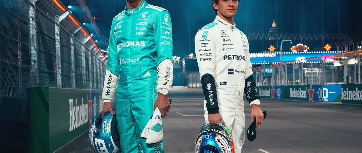
IWC Schaffhausen has designed two bespoke racing suits with the Mercedes-AMG PETRONAS Formula One team for the forthcoming Las Vegas Grand Prix. Announced on 18 November 2026 and published in the watchmaker's pressroom on 19 November, the project takes its inspiration from the contrasting appearances of IWC's Big Pilot's Watch Perpetual Calendar Ceralume. The white suit is intended for Kimi Antonelli and the blue one for George Russell.
The announcement is particularly interesting from a design perspective because the watch and the clothing have very different functions. Rather than attempting to reproduce the construction of a ceramic watch case in a garment, the collaboration uses colour and visual identity to connect the two objects. The choice of a night-time event in Las Vegas provides a setting in which the transition from a white daytime appearance to a blue after-dark appearance can be communicated to an audience.
The watch itself was introduced earlier in 2026. The November announcement is therefore about the racing garments and the relationship between watchmaking and motorsport, not the launch of a new Ceralume timepiece.
Two interpretations of the same design idea
The Big Pilot's Watch Perpetual Calendar Ceralume, reference IW505801, incorporates a luminous white ceramic case measuring 46.5 millimetres in diameter. Its white dial and rubber strap contribute to its daytime appearance. The material can absorb energy from light and subsequently emit a blue glow, changing the appearance of the watch when it is viewed in darkness.
IWC's design for the team separates these two visual characteristics between the drivers. The predominantly white garment refers to the watch's appearance under ordinary lighting; the blue garment represents the colour associated with its glow. Each suit can be understood independently, but the pair expresses the complete design concept more clearly than either colour alone.
That approach is particularly effective in a setting where both drivers are associated with the same team. A conventional team uniform creates continuity between participants, while individual colour treatments can provide a way of expressing a shared idea through two different objects. The November photographs were produced to illustrate that relationship.
It is important not to confuse the inspiration with a technical claim about the garments. The watchmaker describes the suits as inspired by Ceralume. Its release does not establish that the garments contain the same ceramic material or that their fabric produces an equivalent luminous effect in darkness.
The material behind the visual identity
IWC describes Ceralume as an innovation arising from the work of its engineering division, XPL. It combines ceramic powders with photoluminescent pigments. According to the manufacturer, those pigments temporarily store energy from incident light and subsequently emit it, producing the distinctive blue colour visible under appropriate dark conditions.
Photoluminescence is relevant to watch design because the appearance of an object can change substantially according to its illumination. A predominantly white watch in daylight may present a completely different visual character later in the evening. The extent and duration of the effect depend on the characteristics of the material and the conditions under which it has been exposed to light.
A buyer interested in the watch should distinguish between the luminous appearance of its case and the practical visibility of its indications. Those are related but separate questions. A visually striking case does not necessarily establish the ease with which every indication on a complex dial can be read under all conditions.
The perpetual calendar is also a distinct aspect of the reference. It concerns the mechanism responsible for displaying calendar information rather than the composition of the case. A collector may be interested in the combination of the movement and the experimental surface treatment, even though each aspect of the watch can be assessed independently.
Why ceramic matters in contemporary watch design
IWC places the material within a longer history of its work with ceramics. The company's release identifies the use of black zirconium oxide ceramic in its early development of watch cases approximately four decades ago. Since then, advances in the production and finishing of ceramic components have provided watchmakers with alternatives to familiar metallic case materials.
Ceramic can offer a combination of hardness, resistance to surface scratching and a distinctive finish. Those characteristics should not be interpreted as establishing immunity to every form of damage. The suitability of any case material depends on the construction of the watch, the kind of impact or wear it may encounter and the directions supplied by the manufacturer.
For an owner interested in wearing a timepiece during travel or leisure activities, its physical dimensions also matter. A large watch may produce a particularly noticeable visual effect, while a smaller one can be easier to accommodate with some garments. The 46.5-millimetre figure given for the Ceralume Big Pilot's reference is important in that respect. A prospective wearer should examine the actual fit and the way the strap positions the case.
The collaboration with motorsport illustrates another use of material innovation: the ability of a distinctive material to become part of a brand's broader visual language. It is not necessary for every associated object to share the same physical construction for the design reference to remain recognisable.
The particular setting of Las Vegas
The choice of Las Vegas gives the colour treatment a context different from that of an ordinary daytime competition. The city's illuminated architecture and entertainment districts are part of the visual identity associated with the event. A colour that refers to the glow of a watch can be presented alongside those surroundings without requiring the audience to examine the timepiece itself.
For a designer, the translation of a product into an event-specific object involves more than reproducing its exact outline. The essential characteristics need to be identified and interpreted in a form appropriate to the new medium. In this project, the two colour states supply a particularly clear connection.
The official photographs show the garments in an environment chosen to convey the association with motor racing and illuminated surroundings. They are promotional press photographs supplied before the event rather than evidence of a result achieved during the race.
For spectators and travellers considering a visit to Las Vegas, the event announcement also illustrates the range of activities associated with an international motorsport weekend. The racing itself remains distinct from the fashion presentations, hospitality arrangements and product collaborations organised around it. Access to individual events or displays should be checked with the relevant organisers.
Design remains separate from competition equipment requirements
Racing clothing has practical requirements quite different from those of ordinary fashion. Its construction must meet the rules and safety requirements applicable to its use, and a change of visual treatment does not remove those obligations. IWC's announcement concentrates on the inspiration and appearance of the suits rather than providing their complete technical specifications.
A collector interested in motorsport clothing should therefore distinguish a garment intended for actual competition from a reproduction or an item marketed as a fashion product. The provenance of a particular garment, its intended function and its association with an individual event should be established through documentation rather than inferred from its colour.
The November release does not announce a public sale of the two bespoke suits. Nor does it establish that any particular watch, garment or other collectible from the collaboration will be made available to customers. The immediate development concerns the visual presentation of the drivers at the forthcoming event.
The wider relationship between engineering and style
Luxury watchmaking and motor racing often draw attention to the materials and technologies used in their respective products. In this instance, IWC has chosen to communicate a particular material development through a pair of garments. The result is an example of design-led collaboration rather than a claim that the underlying mechanical systems share the same technology.
For Luxury Yacht Guide readers interested in both timepieces and performance-oriented design, the project offers a useful distinction between technical innovation and the ways in which it is expressed visually. A luminous ceramic case can be investigated through its material properties and construction, while the same product's changing appearance can provide an entirely separate source of creative inspiration.
The Vegas collaboration makes that connection visible through the white and blue suits. Its interest lies in the translation of one recognisable characteristic across two different design disciplines, and in the opportunity to see how an idea developed for the scale of a wristwatch can be communicated in the much larger setting of an international sporting event.
Sources and lead image
Source documentation: https://press.iwc.com/iwc-and-mercedes-amg-petronas-formula-one-team-vegas-with-ceralume-racing-suits-en/. Lead image: The white and blue Ceralume-inspired racing suits, IWC Schaffhausen official press photograph — IWC Schaffhausen, original subject-specific photograph supplied with the dedicated pressroom media kit for editorial coverage of the announcement. Official issuer-supplied press photograph, reproduced for editorial coverage of the specific announcement and resized for web display.